Catcher in the Rye
Date
September 2022
Course
Typography I
Focus
Typography
Under the instruction of Professor John Kane, we were asked to re-design a book of our choosing. We were tasked to typeset and design a typographic cover. My project features The Catcher in the Rye.
View full book here
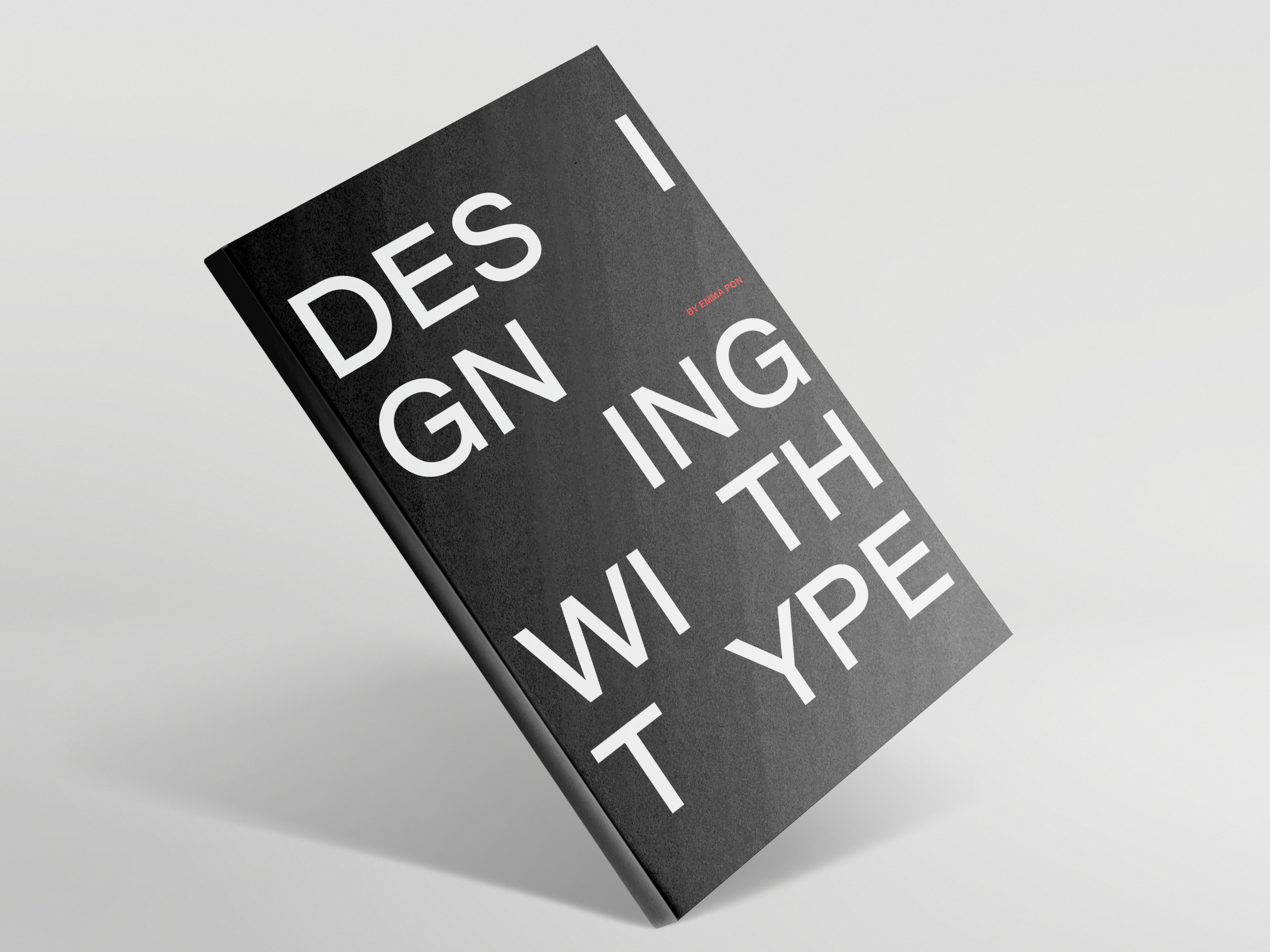
Cover
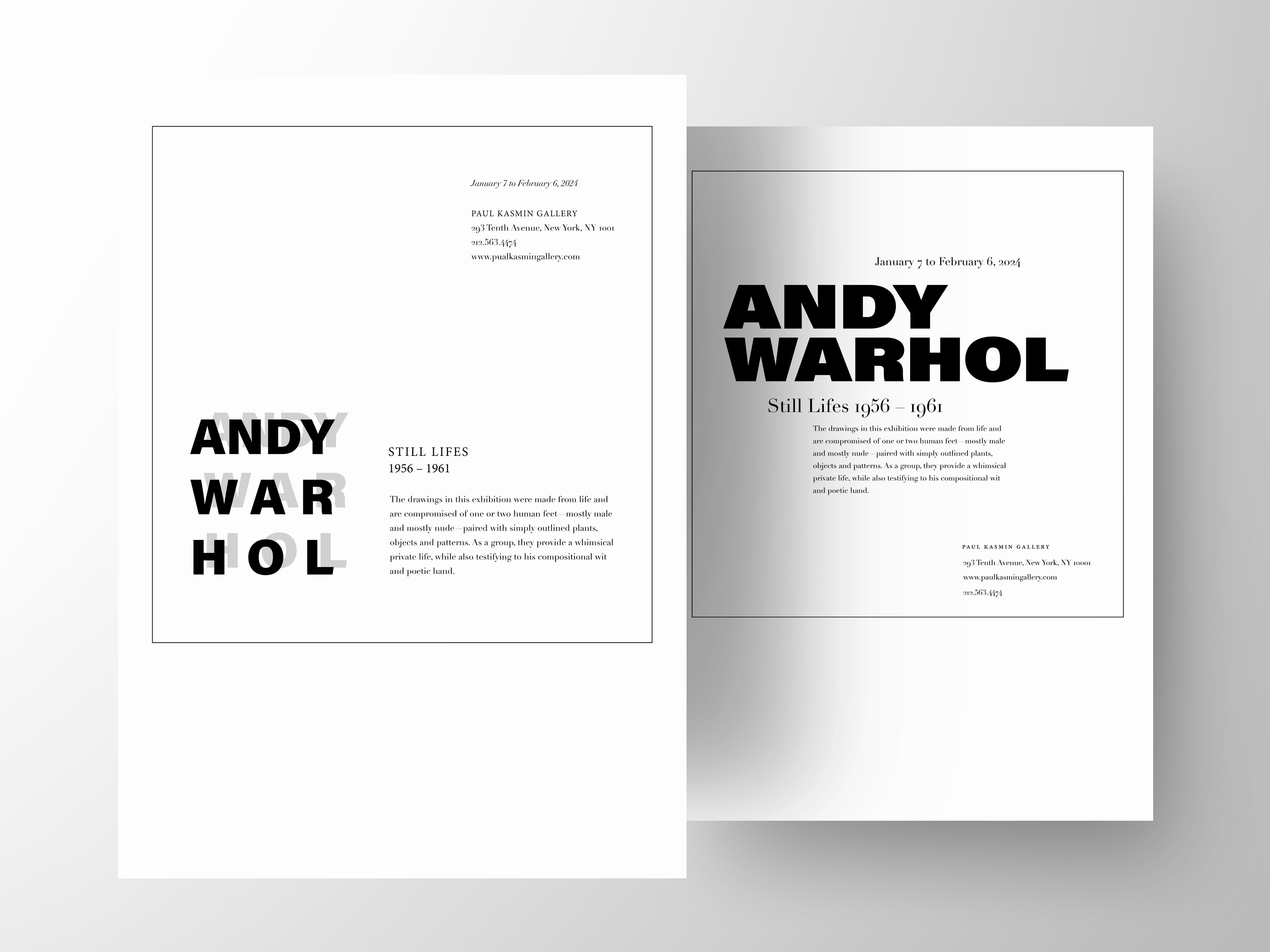
The cover is typeset in Archivo Black. I went with a simpler composition focusing on the letterforms and looked to see how negative space interacted with the letters. To create a more dynamic piece, I worked with opacity and different color palettes which gave the perception of layers.
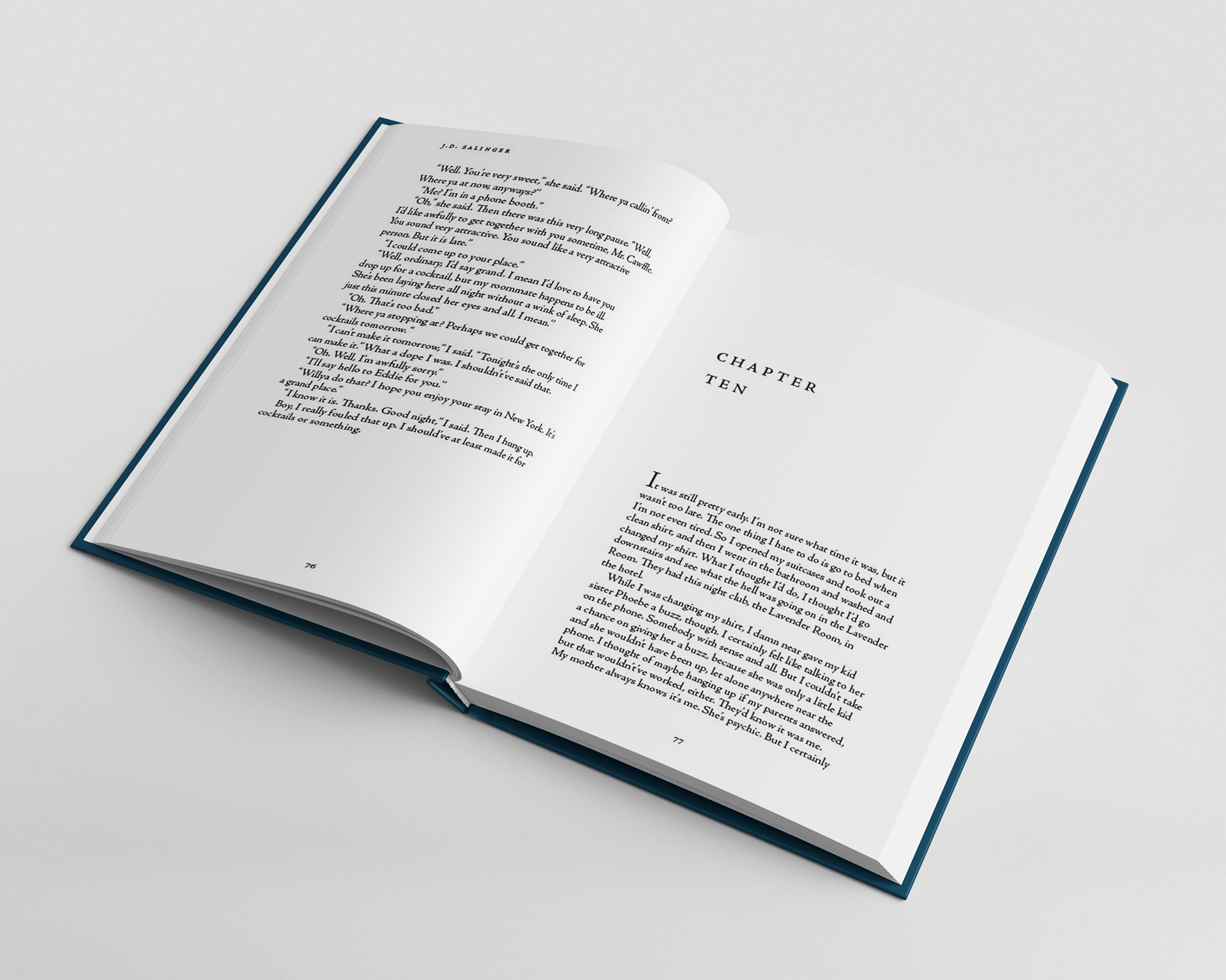
Front Matter and Page Spreads
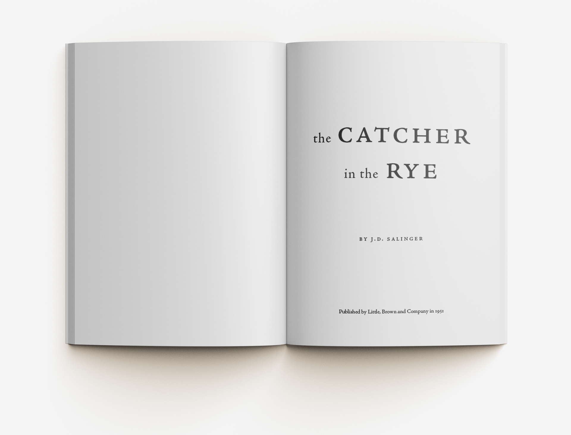
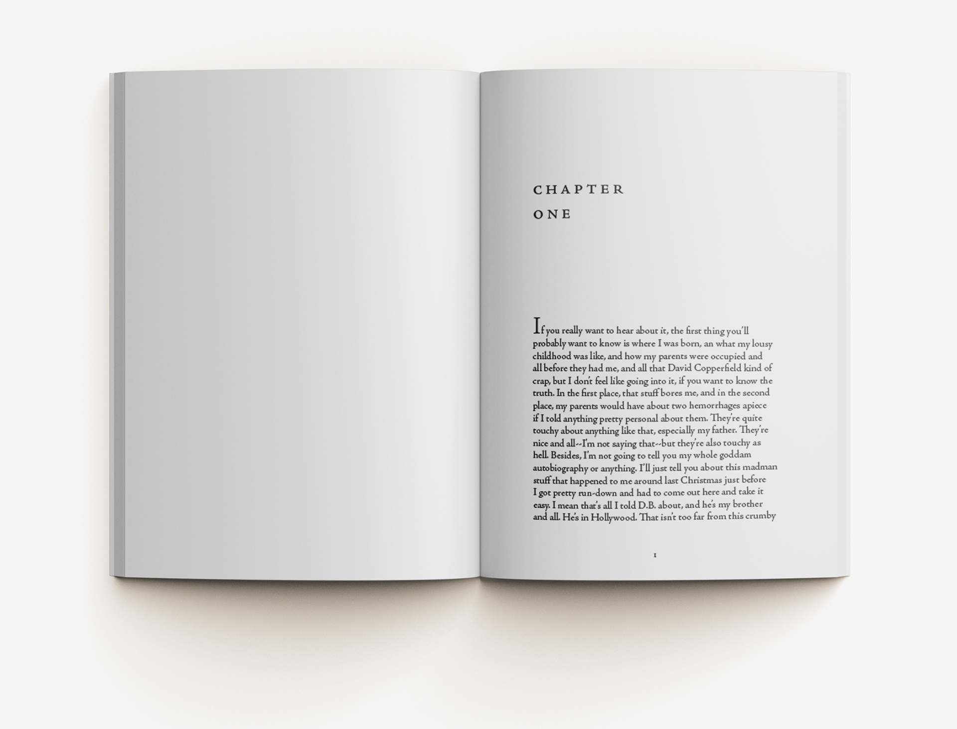
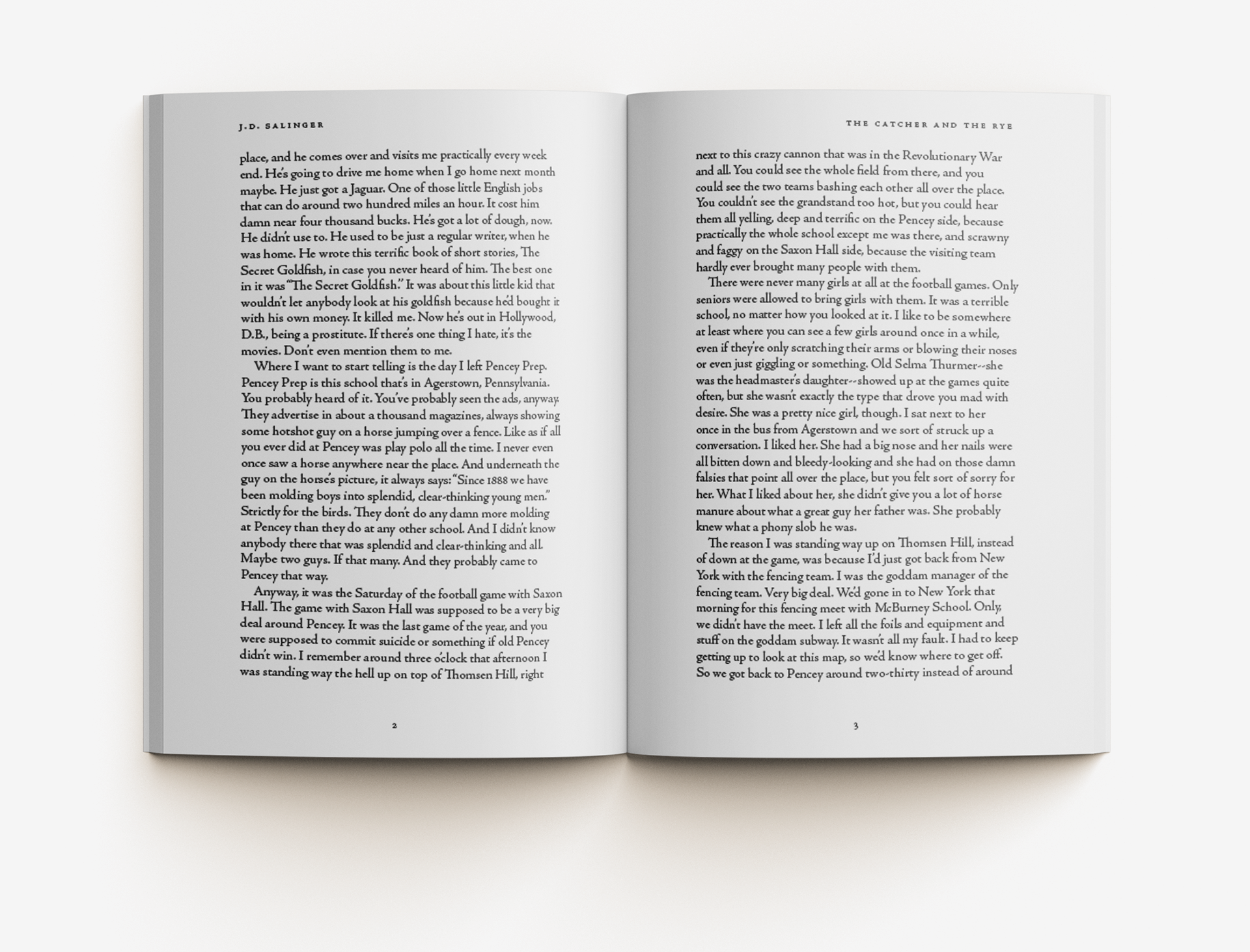
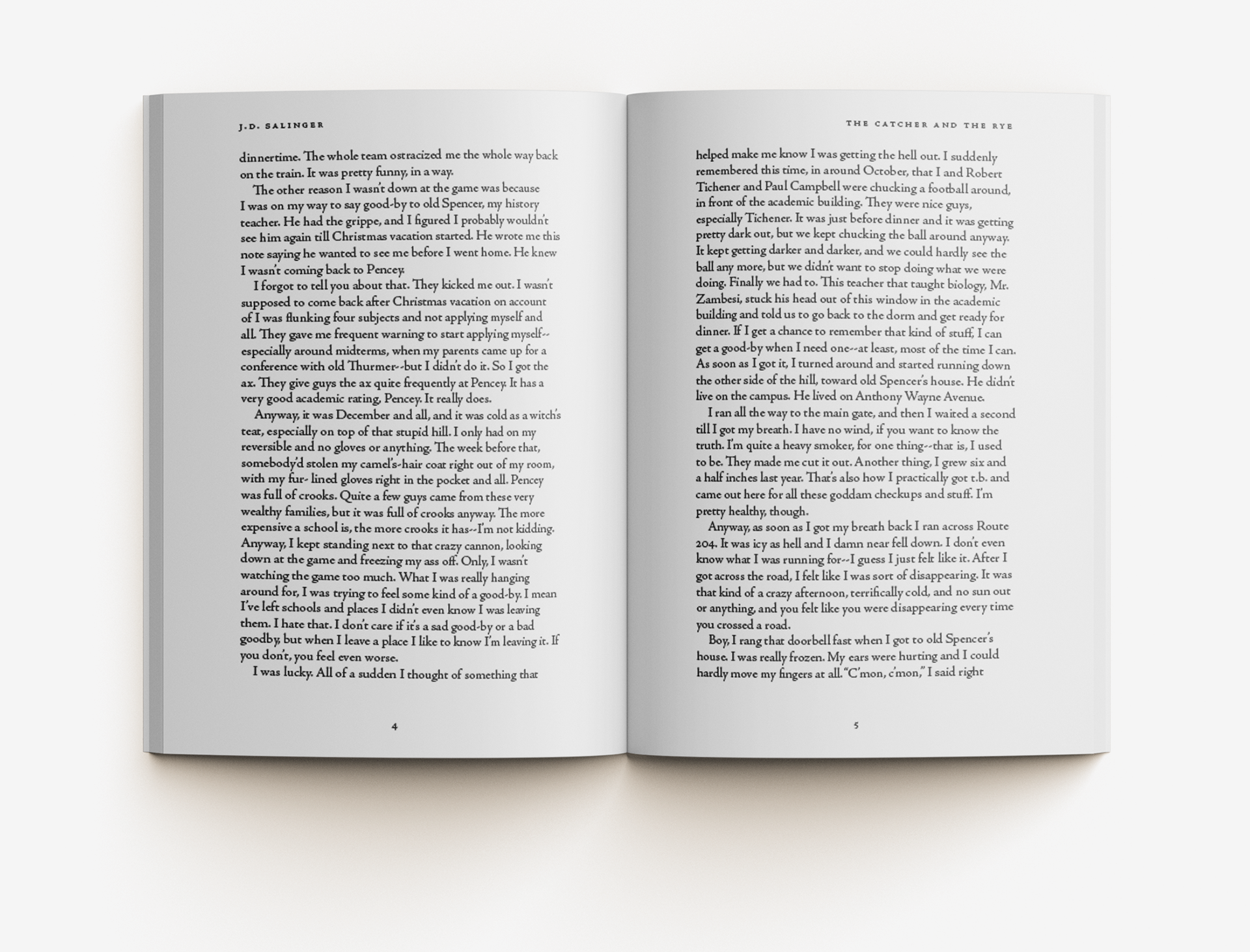
I chose to typeset the front matter and pages in Adobe Jenson Pro, an old-style serif typeface. I often used small caps for titles and headings to indicate hierarchy in the text. Continuing with the theme of simplicity from my cover, I kept all of the chapter openers minimalistic with a two-line header spelling out the chapter number in small caps.